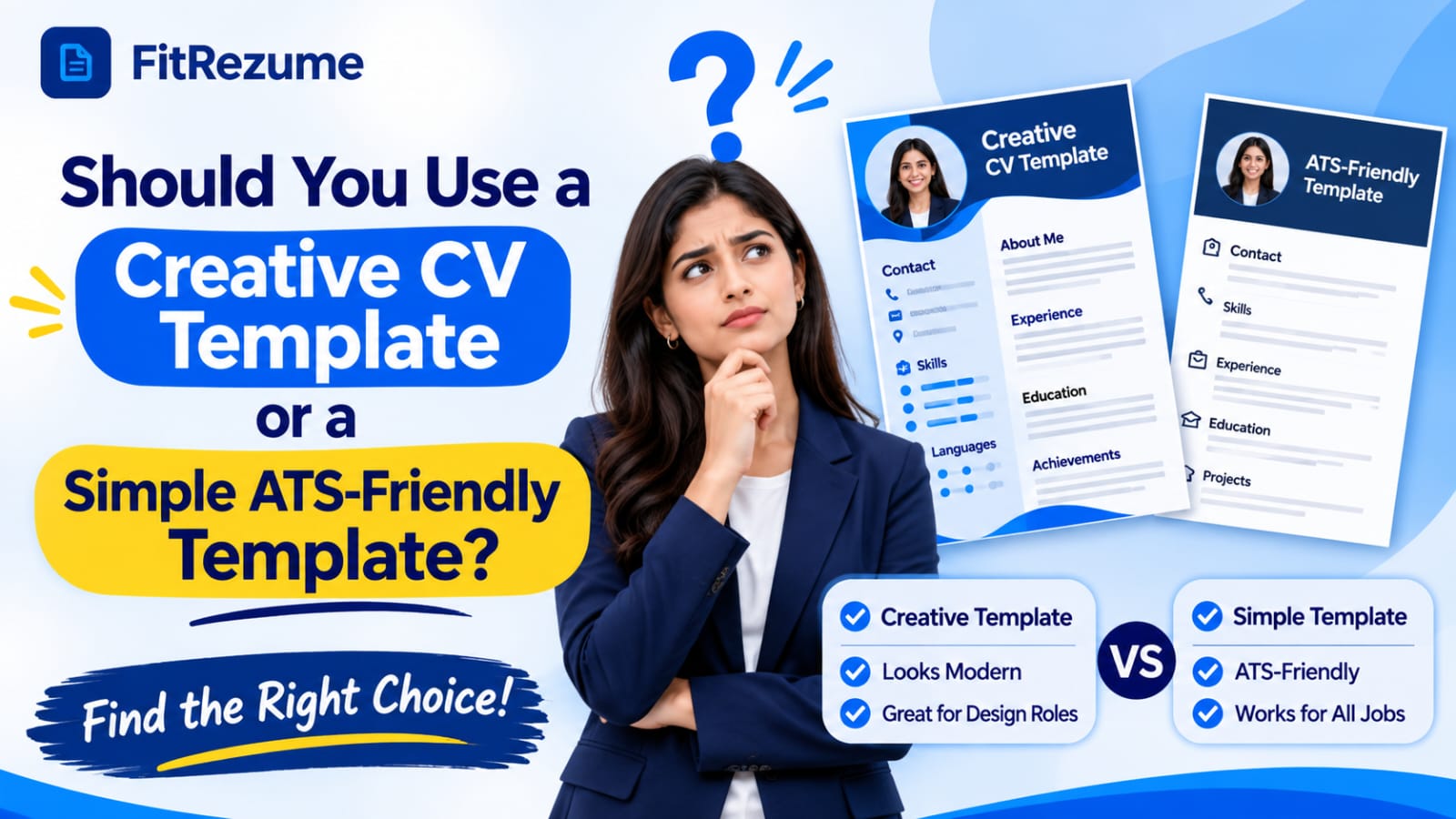
Every job seeker eventually faces the same choice: stand out with a bold design or play it safe with a plain layout. The answer depends on who reads your file first, a person or a software filter. If your application goes through an online portal, an ATS-friendly CV template gives your content the best chance of being read correctly. If it goes straight to a hiring manager, a creative layout can work. This guide compares both options, explains when each one wins, and helps you choose with confidence.
Why Your CV Design Should Match the Expectations of Recruiters?
There is no single winner, because a design that impresses a person can confuse a machine. The best CV design is the one that your first reader can process easily, whether that reader is a recruiter skimming a shortlist or parsing software extracting your details into a database. Before you pick a style, it helps to understand what each type of template does well and where it fails.
What a Creative CV Template Offers?
Creative templates use colour blocks, sidebars, icons, infographics and unusual fonts to create a strong visual impression. They suit designers, marketers, photographers and other roles where presentation is part of the skill set. When you send a creative file directly to a hiring manager, the design itself becomes proof of your taste and attention to detail. The risk appears when that same file is uploaded to an online portal, where fancy elements may not survive the parsing process.
What a Simple ATS Template Offers?
A simple template uses a single column, standard headings and plain text. It looks modest, but it does the job that matters most, which is making sure your name, roles, dates and skills land in the right fields of the employer's system. Recruiters also find these files faster to scan, because everything sits in a predictable place. For most corporate, technical, finance and operations roles, plain structure beats decoration.
How Applicant Tracking Systems Read Your File?
Parsing software converts your document into text and then sorts that text into fields such as job title, employer and education. Text boxes, tables, headers, footers, icons and graphics often break that process. When a section is skipped or scrambled, your profile can look incomplete even though the information is on the page. Many candidates never learn that their file was misread, which is why choosing a safe layout is cheaper than fixing a rejection you never see.
Elements That Commonly Break Parsing
Some design choices cause far more trouble than others. Two column layouts can make software read across the page instead of down it, so your job titles end up mixed with your skills. Contact details placed in a header may be ignored completely. Graphics that contain words, such as a logo with your name or a skills chart, are invisible to a parser. Unusual section titles like My Journey instead of Experience can leave your work history unrecognised. Swapping these for plain equivalents costs you nothing and removes most of the risk.
Finding the Best CV Layout for Your Target Role
The best CV layout changes with the job you want. A software engineer, an accountant and a graphic designer should not send identical files, because each reader expects different proof. Start by reading the job post, looking at the company's hiring process and noting how the application is submitted. Those three clues usually point to the right level of design.
Reading the Job Post for Clues
The posting itself often tells you how much design freedom you have. Phrases such as upload your resume, apply through our careers page or complete the online form point to an automated system. Phrases such as send your portfolio, share samples of your work or email your application suggest a human reader. Company culture matters too. A fashion brand and a bank will judge the same file very differently, so adjust your choice to match the audience.
Roles That Favour Plain Layouts
Corporate roles, government jobs, engineering, finance, healthcare administration and most graduate schemes rely heavily on applicant tracking software. Large employers receive hundreds of applications for each opening, so automated screening is common. For these roles, a single column layout with standard headings is the safest choice. Let your achievements carry the impression instead of your colours.
Roles That Can Handle Creative Layouts
Design, advertising, media, fashion, architecture and some startup roles often welcome visual personality. In these fields, a CV can double as a sample of your craft. Even then, keep the text real and selectable, avoid placing key details inside images, and keep a simpler version ready for portals. A polished portfolio link often does more for a creative candidate than a heavily styled file.
Matching Layout to How You Apply
Think about the delivery route as well as the job title. If you upload to a job board or company portal, use the plain version. If you email a named person, a lightly styled file is fine. If you hand a printed copy to someone at an event, you can be more expressive. Keeping two versions, one plain and one designed, solves most of these situations without extra stress.
Free Resume Templates: What to Check Before You Download
Many people start their search with free resume templates, and that is a sensible move as long as you inspect what you are getting. Some downloads look attractive but hide text in tables, images or text boxes, which defeats the purpose. Our AI resume builder that keeps layouts clean and parser safe, so you can focus on your content. Whatever source you use, run through this checklist first:
Single column structure with no sidebars carrying key information
Standard headings such as Experience, Education, Skills and Projects
Readable fonts such as Calibri, Arial or Georgia at ten to twelve points
Contact details in the body of the page rather than in a header or footer
Simple bullets and consistent spacing without decorative icons
Clean PDF or DOCX export with text you can select and copy
Test the file yourself by copying all the text into a plain notepad window. If the order looks scrambled or details are missing, an automated parser will probably struggle too.
Mistakes Free Downloads Often Hide
Skill bars and star ratings look neat but tell a recruiter nothing, and a parser cannot read them at all. Photos waste space and, in many countries, can introduce bias concerns. Fixed layouts also make editing painful, so a small change can push a section onto another page. Choose a template you can edit without breaking the design.
Free Versus Paid Options
A free template is perfectly acceptable when it follows the structure above. Paying does not guarantee a better parsing result, and many expensive designs are the least readable of all. Judge any option by its structure, not by its price or how modern it looks in a preview image. If a platform lets you edit text, rearrange sections and export a clean file at no cost, you already have everything a strong application needs.
Choosing Professional CV Templates by Career Stage and Application Method
Quality professional CV templates share a few traits: clear hierarchy, generous spacing, consistent formatting and a layout that lets the content lead. The right ATS-friendly CV template also adapts as you grow, because the same clean structure works from your first internship to a senior leadership role. The table below shows how to match style to situation.
FitRezume also pairs its CV builder with LinkedIn profile review and a web portfolio builder, which helps your CV, profile and projects tell one consistent story.
Situation | Recommended Template |
|---|---|
Online portal or job board upload | Simple ATS-friendly, single column |
Large corporate or government role | Simple, traditional structure |
Creative role sent to a named contact | Lightly styled, selectable text |
Fresh graduate or first job | Clean, simple, education and projects first |
Senior or executive role | Refined, minimal, achievement led |
Fresh Graduates and Early Career Candidates
With limited experience, you may be tempted to use design to fill space. Resist that urge, because recruiters value clarity far more than decoration at this stage. Lead with education, internships, projects and skills, and keep the layout simple. A clean page signals maturity and makes it easy for a recruiter to find the strengths you do have.
Experienced and Senior Professionals
Seasoned candidates benefit from a restrained layout that puts leadership, results and scope at the top. Use a short summary, then reverse chronological experience with numbers. A light accent colour for headings is fine, but the content should always remain the star. Senior hiring managers read carefully, and they notice clutter more than they notice style.
Colour, Fonts and White Space
Small styling choices can add polish without hurting readability. Stay with one or two fonts, use a single dark accent colour for headings and leave comfortable margins around the text. White space is not wasted space, because it gives the eye places to rest and makes your strongest lines easier to spot. Test a printed copy and a screen view, since a layout that looks fine on a monitor can feel crowded on paper.
How to Keep Your Template Readable and Professional?
Use one font family, consistent spacing and a limited colour palette. Save your file with a clear name, for example your name and target role. Proofread every section, because a perfect layout cannot rescue careless errors. Tailor your skills and summary to each posting so the keywords match the job description honestly. Review the finished file one last time as a recruiter would, scanning for your name, latest role and strongest result within the first few seconds. If any of those take effort to find, simplify the layout further.
Conclusion
A creative file can impress the right person, yet a simple layout wins most of the time because it is readable by both people and software. For online applications, choose an ATS-friendly CV template. and keep a designed version only for direct, personal submissions. Focus on clear headings, honest keywords and measurable results. If you want a quick start, Our gives you clean ATS-ready templates and guided prompts so you can finish a polished CV today.
Frequently Asked Questions
Is a creative CV template ever better than an ATS template?
Yes, for design roles sent directly to a person, but keep a plain version for portals.
Can ATS software read two-column layouts?
Some can, but many scramble the order, so a single column is safer.
Should I use icons and skill bars in my CV?
Avoid them, since parsers cannot read them and recruiters learn little from them.
Which file type is best for an ATS-friendly CV?
Use a text based PDF or DOCX, unless the job post names a specific format.
How can I test whether my CV is readable by an ATS?
Copy all the text into a plain notepad file and check that the order stays correct.